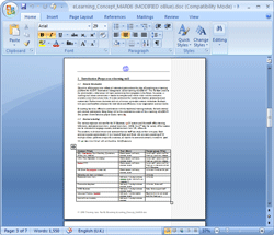
 I received an email from Microsoft updates this morning and there was a link to download the latest beta of Office 2007.
After registering, I got a few files including the Microsoft Office Professional Plus package at about 440MB and proceeded to installing the beast.
I must say that my first impression is that a lot of effort has been put in the interface. It’s simply magnificient, with subtle colours and a very pleasing responsiveness.
 Now for all those Microsoft bashers who can’t see anything out of Redmond without scorn and disdain should look again. MS is often criticised for not being inovative, but they are taking a fairly big risk with Office 2007: the user interface of classic drop-down menus has now been changed for Ribbons, a large band of actions and functions that coherently group actions together, as buttons, menus and drop-downs.
While it’s easy to move around the interface, I can’t really comment yet on how quickly you get used to it or if it’s really a major improvement to usability.
No doubt that legions of corporate users will have to be re-trained to familiarize themselves with the new interface, and that cost is going to make businesses think twice in upgrading the already over-the-top Office 2003 into something that does not really add any must-have features for the average user.
Sure, some large corporations will integrate reviewing and document exchange into their overall Microsoft-supplied architecture and no doubt that MS will find the marketing and commercial pressure points to “encourage” users into upgrading, but let’s face it: what do you need a word processor, a spreadsheet or a presentation package to do?
I’d say that close to 100% of the features you’ll ever need from an office suite have already been implemented years ago, so the pressure to keep you upgrading is now focused on improvements that most of us will never use anyway and, of course… eye-candy.
Microsoft is taking a gamble but they have to: after Office 2003 there is not really anything significant to accomplish in the realm of office suites.
Microsoft is trying to pull the rug under eveyone’s feet to make sure it still has the lead in some ways: between a demure-looking OpenOffice and the latest itration of MS Office, it’s going to be hard not to consider OO outdated, and I’m sure Microsoft will exploit that very feeling.
Apple has demonstrated that User Interface is everything.
I mean it!
Apple’s hardware and software have polished, beautiful UIs.
They have made of eye-candy and ease of use their driving marketing force.
Everyone just assumes that an iPod is vastly superior in quality to anything else, but that’s not true. Everyone just want an iPod because they easy to use and are beautiful objects to own, like affordable jewelry that actually has a function. That has made them cool.
Microsoft is now selling us improved software that we don’t really need, but that they need to shove down our throat to keep themselves in business.
To achieve that and attract us like flies to dung, they have polished their products and made them very shinny.
I’m sure we won’t be able to resist…
Comments
Its a nice post about online rugs buying because Online buying is fast becoming the most preferred mode of shopping whereby shoppers can reap the advantages of Internet shopping from the luxury of their homes.
Comments are closed.